
Transforming Sales Data into Powerful Insights with Tableau
A sales spreadsheet can look busy and still fail to answer basic questions. Which region is growing? Which category brings in revenue but weak profit? Are orders increasing, or are a few large deals hiding a slowdown?
That is where a well-built Tableau Sales & Profit dashboard changes the conversation. It turns rows of sales, profit, orders, categories, dates, and regions into a visual system people can explore. Instead of scanning raw data line by line, decision-makers can see patterns, compare performance, and focus on the areas that need attention.
Turning raw sales data into a reliable foundation

Every useful dashboard starts before the first chart appears. Raw sales data often contains repeated fields, inconsistent category names, blank values, date formatting issues, and records that need to be joined from different files. Tableau can visualize many kinds of data, but the output is only as useful as the structure behind it.
For a Sales & Profit dashboard, the core data usually centres on three connected measures:
Data element | What it helps explain |
Sales | Total revenue generated by products, categories, segments, or regions |
Profit | The amount left after costs, discounts, and other deductions |
Orders | Transaction volume and buying activity over time |
Bringing these together allows the dashboard to answer more than one question at a time. Sales alone can be misleading. A product line might have high revenue but low profit. Order count alone can also hide the truth. Many small orders may create activity without adding much value.
Building a dashboard around the questions that matter
A strong dashboard does not try to show everything at once. It guides the user through the business story.
For a Sales & Profit dashboard, the layout often starts with headline performance indicators. These summary metrics give a quick read on the business:
Total sales
Total profit
Number of orders
Average profit margin
Sales or profit change by period

These figures help users understand the current state before exploring the details. From there, the dashboard can expand into visual sections for trends, categories, margins, and regions.
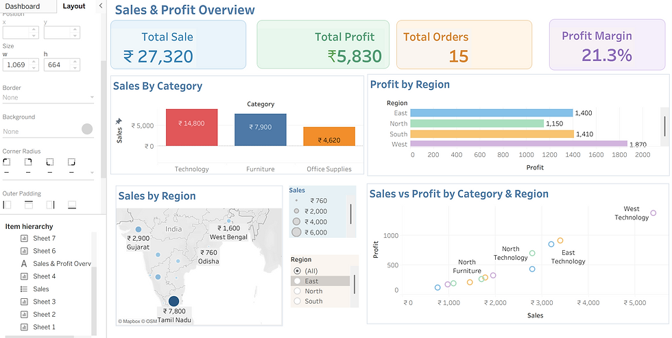
Sales by Category
Shows the total sales generated by Technology, Furniture, and Office Supplies. Technology has the highest sales, followed by Furniture and Office Supplies.This helps identify which product categories contribute most to overall sales.
Profit by Region
Compares profit performance across East, North, South, and West regions. The West region generates the highest profit, while North has the lowest. This helps identify the most profitable regions.
Sales by Region
Displays sales performance across different regions using a geographical map. Tamil Nadu shows the highest sales, followed by other locations. This provides a clear view of regional sales distribution.
Sales vs Profit by Category & Region
Shows the relationship between sales and profit across categories and regions. The chart helps compare how different regions and categories perform together. This makes it easier to identify high-sales and high-profit combinations.
Interactive filters turn a report into a decision tool
In Tableau, filters can be added for fields such as date range, region, category, segment, and shipping mode. These filters help users narrow the view without rebuilding the dashboard or exporting data.
A decision-maker might start with total sales for the year, then filter to the West region, then select the Technology category, then compare profit margins by state. Another user might filter by a single quarter to see whether a promotion increased order volume but reduced profit.
Useful filters include:
Date filters for monthly, quarterly, or yearly views
Region filters for geographic comparison
Category filters for product performance
Segment filters for customer behaviour
Profit range filters for exception review
How the dashboard supports better business decisions
The biggest value of a Tableau dashboard is not the visuals themselves. It is the speed and clarity they bring to decisions.
When sales, profit, orders, margins, categories, and geography sit in one view, the business can spot relationships that would be easy to miss in raw data. A sales spike becomes more meaningful when paired with margin movement. A high-order region becomes more useful when compared with actual profit. A category that looks strong at the top level may need attention once discounts and costs appear.
A good dashboard helps leaders:
Monitor performance without waiting for manual reports
Compare regions and categories using the same measures
Find underperforming areas faster
Test business questions through filters
Align teams around the same version of the data
It also creates a shared language. Instead of debating different spreadsheets, teams can point to the same dashboard and ask better questions.
A raw dataset holds the facts, but a dashboard gives those facts shape. By connecting sales, profit, and orders, analysing margins, mapping regional performance, and adding interactive filters, Tableau turns scattered records into a practical guide for business performance.
The best result is a dashboard that answers the first question clearly and makes the next question easy to explore.


Comments