
Clinical Trial Enrollment and Site Performance: Using Power BI to Monitor Recruitment and Site Effectiveness

Introduction
Clinical trial enrollment is one of the most important operational areas to monitor during a clinical study. When a study includes multiple research sites, different countries, and varying patient recruitment rates, understanding site-level performance becomes increasingly important.
A centralized Power BI dashboard can bring clinical trial enrollment and site performance data together into one interactive analytical environment.
In this second dashboard of the RUSA Analytics Clinical Trial Intelligence solution, the focus is on Enrollment and Site Performance. The dashboard provides a detailed view of patient recruitment, enrollment pace, site performance, site rankings, and potential high-risk sites.
With Power BI, clinical trial teams can move beyond a single enrollment number and explore where enrollment is happening, how quickly recruitment is progressing, and how individual sites contribute to overall study performance.
The RUSA Analytics approach combines data modeling, DAX calculations, and interactive Power BI visualizations to transform clinical trial data into a structured analytical experience.

RUSA Analytics Power BI dashboard for monitoring clinical trial enrollment and site performance.
What Is Clinical Trial Enrollment and Site Performance Analytics?
Clinical trial enrollment and site performance analytics focuses on understanding how effectively individual research sites contribute to patient recruitment and overall study progress.
A clinical trial may have many sites, but not every site will perform at the same level.
Some sites may recruit patients quickly, while others may have slower enrollment. Some sites may demonstrate strong operational performance, while others may require additional monitoring.
This is where Power BI analytics can provide value.
Instead of reviewing individual tables or manually comparing site records, users can interact with a centralized Power BI report and analyze metrics across studies, sites, countries, and time periods.
The RUSA Analytics clinical trial dashboard is designed to provide this type of site-level visibility.
Why Clinical Trial Enrollment Analytics Matters
Monitoring total enrollment alone may not provide enough information about trial performance.
For example, a study could have a strong overall enrollment number while some individual sites are contributing very few patients.
Similarly, one site may have excellent recruitment performance while another site may require additional operational attention.
A Power BI dashboard can help answer questions such as:
How many patients have been enrolled?
How many sites are currently active?
Which sites are performing strongly?
Which sites have slower enrollment?
How quickly is enrollment progressing?
Which sites may require additional attention?
How does enrollment differ between studies?
What is the average site enrollment rate?
Which sites are contributing most to overall recruitment?
This makes Power BI for clinical trial analytics useful for both high-level monitoring and detailed site analysis.
RUSA Analytics Clinical Trial Enrollment Dashboard
The second page of the RUSA Analytics Clinical Trial Intelligence Dashboard focuses specifically on recruitment and site performance.
The dashboard combines KPI cards and interactive Power BI visuals to provide a detailed view of enrollment activity.
The main KPIs include:
Total Enrollment
Active Sites
Average Site Enrollment Rate
Average On-Time Score
High-Risk Site Count
These KPIs provide an immediate summary before users move into detailed site and enrollment analysis.
Total Enrollment
The Total Enrollment KPI provides an overall view of the number of enrolled patients represented in the current analysis.
This metric gives stakeholders a starting point for understanding recruitment performance.
However, total enrollment alone does not explain how patients are distributed across different sites.
For example, two studies may have similar enrollment totals but very different site-level recruitment patterns.
One study may have consistent enrollment across many sites, while another may depend heavily on a small number of high-performing sites.
Using Power BI, the total enrollment metric can be analyzed alongside site, study, country, and time-based dimensions.
Active Sites
The Active Sites KPI provides visibility into the number of active sites represented in the current analysis.
The number of active sites provides important context when interpreting enrollment.
For example, high enrollment across many active sites represents a different recruitment pattern from the same enrollment being generated by only a small number of sites.
By combining Active Sites with Total Enrollment, the RUSA Analytics Power BI dashboard provides a broader view of recruitment distribution.
Average Site Enrollment Rate
The Average Site Enrollment Rate provides a more detailed perspective on site-level recruitment.
Instead of looking only at total patient enrollment, this metric focuses on how individual sites are performing.
This is particularly useful when a clinical trial contains multiple sites with different recruitment results.
Using Power BI DAX measures, the metric can be calculated dynamically based on the current filter context.
For example, users can select a study, country, or site and analyze how enrollment performance changes.
This makes the Power BI clinical trial dashboard more flexible than a static report.
Average On-Time Score
Clinical trial performance is not limited to patient recruitment.
Operational timeliness can also provide useful information when evaluating site performance.
The Average On-Time Score provides an additional performance indicator that can be analyzed alongside enrollment metrics.
A site may have strong recruitment but weaker operational performance, while another site may demonstrate a different combination of metrics.
Using Power BI, these different performance dimensions can be displayed together so users can identify patterns that may not be visible when looking at a single KPI.
High-Risk Site Count
The High-Risk Site Count provides an indication of sites that meet the defined criteria for additional operational attention.
In the RUSA Analytics Power BI solution, risk classification can be based on the metrics and business rules defined within the analytical model.
The purpose of this KPI is not to automatically make a clinical or regulatory decision.
Instead, it provides a monitoring indicator that can help users identify sites that may require further investigation.
Patient Recruitment Funnel
The Patient Recruitment Funnel is one of the key visuals in the Power BI dashboard.
A recruitment funnel provides a visual representation of patient progression through different recruitment stages.
Instead of displaying only the final enrollment number, the funnel provides additional context about how patients move through the recruitment process.
This can help users investigate questions such as:
Where are the largest reductions occurring?
Are enough patients progressing toward enrollment?
Are recruitment stages performing consistently?
Does one study have a different recruitment pattern from another?
When combined with Power BI filters and slicers, the recruitment funnel becomes an interactive analytical component.

Patient recruitment funnel created in Power BI to analyze clinical trial recruitment progression.
Enrollment Pace by Study
The Enrollment Pace by Study visualization allows users to compare recruitment performance across different studies.
This helps stakeholders move beyond the overall enrollment number and understand how individual studies contribute to the clinical trial portfolio.
Using Power BI visualizations, users can identify:
Studies progressing quickly
Studies with slower recruitment
Differences in recruitment patterns
Studies requiring additional investigation
This type of comparison can be particularly useful when multiple studies are monitored within the same analytics environment.
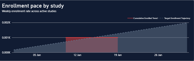
Power BI enrollment pace analysis comparing recruitment performance between clinical studies.
Site Performance Scatter Plot
The Site Performance Scatter Plot provides a visual comparison of site-level performance.
A scatter plot can display multiple performance dimensions simultaneously, allowing users to identify groups, patterns, and potential outliers.
For example, the Power BI scatter plot can help users identify:
High-performing sites
Lower-performing sites
Unusual performance patterns
Potential outliers
Sites requiring further investigation
This makes the scatter plot an important part of the RUSA Analytics site performance analysis.
Instead of reviewing dozens of individual site records manually, users can visually explore site performance within the Power BI report.

Site performance scatter plot created with Power BI to compare clinical trial sites.
Site Ranking
The Site Ranking visual provides another way to compare individual clinical trial sites.
While the scatter plot is useful for identifying patterns, ranking provides a more direct comparison of site performance.
A Power BI ranking can help answer questions such as:
Which sites are performing best?
Which sites have lower performance?
Which sites may require further investigation?
How does one site compare with the overall portfolio?
The ranking can be dynamically calculated using DAX measures within the Power BI data model.
Dynamic Site-Level Analysis with Power BI
One of the important principles of the RUSA Analytics dashboard is that site-level values should not be manually entered.
Instead, Power BI DAX measures can calculate the required metrics dynamically based on the selected Site_ID.
When a user selects a particular site, the relevant measures can automatically recalculate according to that site's underlying data.
This makes the Power BI report scalable.
If additional sites are added to the dataset, the analytical model can continue calculating the metrics without requiring individual values to be manually created for every site.
This is especially useful when working with clinical trial datasets containing multiple research sites.
Using DAX in Power BI for Site Performance
DAX plays an important role in building the RUSA Analytics Power BI clinical trial dashboard.
Measures can be created for metrics such as:
Total Enrollment
Enrollment Rate
Average Site Enrollment
On-Time Performance
Site Risk
Site Ranking
Study-Level Enrollment
Time-Based Enrollment
Because these calculations are created as Power BI measures rather than manually entered values, they respond to filters and slicers.
For example:
Study → Site → Country → Date
When a user changes the selected filter, Power BI recalculates the relevant metrics based on the current filter context.
This makes the dashboard interactive and scalable.
Site-Level Filtering in Power BI
Interactive filtering is another important feature of the RUSA Analytics Power BI solution.
Users can filter the report based on:
Study
Site
Country
Date
Time period
Other available clinical trial dimensions
For example, selecting a specific Site_ID can allow users to examine that site's enrollment performance and associated operational indicators.
This approach eliminates the need to create a separate static report for every site.
From Clinical Trial Portfolio to Individual Site
The first dashboard page provides the Executive Overview.
The second dashboard page takes the analysis one level deeper by focusing on enrollment and site performance.
The analytical journey can be represented as:
Clinical Trial Portfolio
↓
Study Performance
↓
Enrollment Performance
↓
Site Performance
↓
Site Ranking
↓
Potential Areas Requiring Attention
Identifying Sites That Need Attention
One of the advantages of combining multiple Power BI metrics is that stakeholders can look beyond a single performance indicator.
For example, a site may show:
High enrollment + weaker operational performance
or
Lower enrollment + strong operational performance
or
Strong overall performance
or
Performance requiring additional investigation
This multidimensional approach is more informative than ranking sites using only one metric.
The RUSA Analytics Power BI dashboard therefore provides a starting point for deeper operational investigation.
Why Site-Level Power BI Analytics Is Important
Clinical trial performance is influenced by activity across individual research sites.
A portfolio-level KPI may indicate that enrollment is progressing, but site-level Power BI analysis can reveal the distribution behind that number.
For example, if a small number of sites are responsible for a large proportion of enrollment, the overall portfolio may appear healthy while other sites contribute relatively little.
Power BI can make these differences visible through interactive charts, rankings, filters, and DAX calculations.
This allows teams to move from:
“How is the clinical trial performing?”
to:
“Which sites are driving the performance?”
and finally:
“Which sites may require further investigation?”
Benefits of the RUSA Analytics Power BI Enrollment Dashboard
A well-designed RUSA Analytics Power BI dashboard can provide several analytical benefits.
Centralized Recruitment Monitoring
Clinical trial enrollment information can be viewed within one Power BI analytical environment.
Site-Level Visibility
Users can move from overall enrollment to individual site performance.
Faster Performance Comparison
Power BI visualizations make differences between sites easier to identify.
Interactive Analysis
Users can analyze studies, sites, countries, and time periods using filters and slicers.
Dynamic DAX Calculations
Power BI DAX measures allow site metrics to update automatically based on the current filter context.
Scalable Reporting
New site records can be incorporated into the analytical model without manually creating individual dashboard values.
Better Operational Monitoring
Combining enrollment and site performance metrics provides a broader view of clinical trial recruitment.
How RUSA Analytics Uses Power BI for Clinical Trial Intelligence
RUSA Analytics focuses on transforming complex data into useful analytics and intelligence solutions.
For a clinical trial analytics solution, Power BI can provide the visualization and business intelligence layer required to transform structured clinical trial data into interactive reports.
The RUSA Analytics approach combines:
Clinical Trial Data
↓
Data Modeling
↓
DAX Calculations
↓
Power BI Visualizations
↓
Interactive Analysis
↓
Clinical Trial Intelligence
The value is not simply in creating attractive charts.
The real value comes from designing a reliable data model, defining meaningful metrics, creating dynamic DAX calculations, and presenting the information through Power BI in a way that makes operational analysis easier.
Conclusion
Clinical trial enrollment should not be evaluated only by looking at the total number of enrolled patients.
Understanding where enrollment is happening, how individual sites are performing, and how recruitment differs across studies provides a much deeper perspective.
The RUSA Analytics Power BI Enrollment and Site Performance Dashboard provides detailed analysis of:
Total Enrollment
Active Sites
Average Site Enrollment Rate
Average On-Time Score
High-Risk Site Count
Patient Recruitment Funnel
Enrollment Pace by Study
Site Performance
Site Ranking
With Power BI, these metrics can be presented through interactive visualizations and dynamic DAX calculations.
The result is a more detailed view of clinical trial recruitment and site performance that helps users move from portfolio-level monitoring toward site-level analysis.
For RUSA Analytics, this type of Power BI solution demonstrates how modern data analytics, data modeling, DAX, and interactive visualization can transform complex clinical trial data into a structured Clinical Trial Intelligence Dashboard.
The combination of RUSA Analytics + Power BI creates a strong foundation for analyzing enrollment, understanding site performance, identifying potential areas requiring attention, and supporting data-driven operational monitoring.


Comments