
Patient Safety Analytics Dashboard: Monitoring Adverse Events with Power BI | RUSA Analytics-

Introduction
Patient safety is one of the most important areas of clinical trial monitoring. Clinical studies can generate large volumes of adverse event information, including event severity, seriousness, reporting patterns, and study-level safety indicators.
When this information is distributed across datasets, identifying important patterns can become difficult.
A Power BI Patient Safety Dashboard can bring these safety-related metrics into a centralized analytical environment and make them easier to monitor through interactive visualizations.
As the third dashboard in the RUSA Analytics Clinical Trial Intelligence solution, the Patient Safety dashboard focuses on adverse events, event severity, serious adverse events, reporting trends, safety signals, and areas requiring further review.
The objective is not simply to display adverse event numbers. The objective is to provide a structured Power BI analytics view that helps users understand safety-related patterns within the available clinical trial data.

RUSA Analytics Power BI Patient Safety Dashboard for analyzing adverse event patterns and clinical trial safety indicators.
What Is a Patient Safety Analytics Dashboard?
A Patient Safety Analytics Dashboard is a centralized reporting and analytics solution designed to provide visibility into safety-related clinical trial information.
Instead of reviewing individual adverse event records separately, users can analyze summarized information through Power BI visuals.
The dashboard can provide visibility into areas such as:
Total Adverse Events
Serious Adverse Events
Adverse Event Severity
Grade 3+ Adverse Events
Moderate or Severe Events
Safety Trends
Reporting Timeliness
Study-Related Events
Safety Signals
Review Queues
By bringing these metrics together, Power BI can provide a more structured view of the safety information represented in the dataset.
Why Patient Safety Analytics Matters
Clinical trial safety information can be complex.
A single study may contain a large number of adverse event records with different severity levels and characteristics.
Looking only at the total number of adverse events may not provide enough context.
For example, two studies may have the same number of adverse events but completely different severity distributions.
This is why safety analytics should consider multiple dimensions.
A Power BI dashboard can help users explore questions such as:
How many adverse events are recorded?
How many events are serious?
What percentage of events are higher severity?
How are adverse events changing over time?
Which studies show higher event concentrations?
Are reporting patterns changing?
Which areas may require additional review?
The RUSA Analytics Power BI approach brings these different analytical perspectives together within a single report.
RUSA Analytics Patient Safety Power BI Dashboard
The third page of the Clinical Trial Intelligence solution focuses on Patient Safety.
The dashboard includes KPI cards and visualizations designed to provide a high-level overview before allowing users to explore detailed safety patterns.
The key KPIs displayed on the dashboard include:
Total AEs
Serious AEs
AEs Grade 3+ %
Moderate or Severe AEs %
Study-Related Deaths
These indicators provide a quick summary of the safety-related information available in the dataset.
Total Adverse Events
The Total AEs KPI provides an overall count of adverse event records represented in the current analysis.
This metric gives users an initial understanding of the volume of safety-related events in the dataset.
However, the total number should not be interpreted in isolation.
The dashboard allows the total to be analyzed alongside severity, seriousness, time, and other available dimensions.
This is where Power BI becomes useful because users can move from a high-level number toward a more detailed analytical view.
Serious Adverse Events
The Serious AEs KPI provides a focused view of serious adverse events represented in the dataset.
Seriousness is an important analytical dimension when reviewing adverse event information.
By presenting Total AEs and Serious AEs together, the dashboard provides additional context around the distribution of events.
Power BI allows these metrics to be filtered and analyzed according to the available study and date dimensions.
Grade 3+ Adverse Events
The AEs Grade 3+ % KPI provides a percentage-based view of higher-grade adverse events represented in the dashboard.
A percentage metric can be useful because it provides context relative to the overall adverse event population.
Instead of looking only at an event count, users can analyze the proportion represented by the defined grade category.
The calculation can be implemented using Power BI DAX, allowing it to respond dynamically to report filters.
Moderate or Severe Adverse Events
The Moderate or Severe AEs % KPI provides another severity-oriented perspective.
Combining multiple severity-related metrics allows users to understand the distribution of adverse events from different angles.
This is particularly useful when comparing studies or filtering the dashboard to a particular analysis context.
Study-Related Deaths
The Study-Related Deaths KPI is displayed as a separate safety indicator in the dashboard.
Because this is a highly sensitive clinical safety metric, it should always be interpreted within the appropriate clinical, regulatory, and study context.
The Power BI dashboard provides the analytical presentation of the underlying dataset; it does not independently determine clinical causality or replace qualified safety review.
Adverse Event Severity Distribution
The Patient Safety dashboard includes a severity distribution visualization.
This visual helps users understand how adverse events are distributed across different severity categories.
Instead of displaying only a total number, the visualization provides a breakdown of the event population.

Adverse event severity distribution visual created in Power BI for clinical trial safety analysis.
Why Severity Distribution Is Important
A total adverse event count does not explain the characteristics of those events.
A severity distribution provides additional analytical context.
For example, users can investigate whether the event population contains a larger proportion of lower-severity events or whether higher-severity categories represent a meaningful portion of the dataset.
Power BI makes this information easier to explore interactively.
Users can apply available filters and observe how the severity distribution changes for different studies or time periods.
Safety Trend and Reporting Timeliness
Another important component of the dashboard is the safety trend and reporting timeliness analysis.
Time-based analysis allows users to understand how safety-related event reporting changes over the available period.
Instead of examining individual event records, the Power BI trend visualization provides a summarized view of reporting activity.
This can help users investigate questions such as:
Are reported events increasing or decreasing?
Are reporting patterns changing over time?
Are there periods with higher event activity?
How does reporting activity differ across studies?

Power BI safety trend analysis showing changes in adverse event reporting over time.
Safety Signal Heatmap
The Safety Signal Heatmap provides a more detailed visual perspective on safety-related patterns.
Heatmaps are useful when multiple categories or dimensions need to be compared simultaneously.
Within the clinical trial analytics dashboard, the heatmap can help users identify areas where event activity is more concentrated based on the dimensions represented in the visual.
This can make patterns easier to identify than reviewing a large table of individual records.

Safety signal heatmap created with Power BI to visualize patterns in clinical trial adverse event data.
Safety Review Queue
The Safety Review Queue provides another important analytical component.
A dashboard should not only display historical information.
It should also make it easier to identify records or areas that may require additional review based on the defined analytical rules.
The review queue can therefore act as a bridge between analytics and operational monitoring.
Power BI can help users organize and filter the information so that areas requiring further investigation are easier to identify.
Using DAX for Patient Safety Metrics
DAX is an important component of the RUSA Analytics Power BI Patient Safety Dashboard.
Measures can be used to calculate metrics such as:
Total Adverse Events
Serious Adverse Events
Grade 3+ Percentage
Moderate or Severe Percentage
Study-Related Events
Event Trends
Reporting Timeliness
Safety Ratios
Other defined safety indicators
The advantage of using DAX measures is that calculations can respond to the current filter context.
For example, if the user filters the dashboard to a particular study, the relevant safety metrics can automatically recalculate according to the selected data.
Dynamic Patient Safety Analysis with Power BI
The interactive nature of Power BI allows safety information to be explored from multiple perspectives.
Depending on the data model, users can analyze information by:
Study
Date
Severity
Seriousness
Site
Patient-related dimensions
Other available categories
For example, selecting a particular study can update the KPI cards, severity distribution, trends, and other visuals.
This creates a connected analytical experience instead of separate static charts.
Patient Safety Data Flow
The Patient Safety analytics process can be represented through a simple workflow.
From Adverse Event Data to Safety Intelligence
Raw adverse event data can be difficult to interpret when viewed as individual records.
Power BI helps transform these records into summarized analytical views.
The process can be understood as:
Raw Safety Data
↓
Structured Data
↓
DAX Calculations
↓
Power BI KPIs
↓
Interactive Visualizations
↓
Safety Pattern Analysis
↓
Areas for Further Review
This approach allows users to move from raw information toward a more understandable analytical picture.
Why Power BI Is Useful for Patient Safety Analytics
Power BI provides several capabilities that make it suitable for analytical safety reporting.
These include:
Interactive Visualizations
Charts and KPI cards provide an easy way to summarize complex information.
Dynamic DAX Measures
Measures can calculate safety metrics based on the current filter context.
Time-Based Analysis
Trend visuals can help users understand changes in reporting activity over time.
Multi-Dimensional Analysis
Users can explore safety information across different available dimensions.
Filtering and Slicers
Interactive filters allow users to focus on specific studies, dates, sites, or categories.
Centralized Reporting
Multiple safety indicators can be presented in a single Power BI report page.
The Role of RUSA Analytics in Clinical Trial Intelligence
The goal of RUSA Analytics is to transform complex data into meaningful analytics and intelligence experiences.
In this clinical trial dashboard project, Power BI serves as the visualization and analytics platform.
The combination of RUSA Analytics methodology and Power BI capabilities creates a structured workflow:
Clinical Trial Data
↓
Data Foundation
↓
Data Transformation
↓
Data Modeling
↓
DAX Measures
↓
Power BI Dashboard
↓
Safety Analytics
↓
Operational Monitoring
The dashboard demonstrates how data can be transformed into an interactive analytical experience without relying only on static tables or manually prepared reports.
Key Benefits of the Patient Safety Power BI Dashboard
A well-designed Patient Safety Power BI dashboard can provide:
Centralized Safety Monitoring
Important safety-related indicators can be viewed in one location.
Faster Pattern Identification
Visualizations can make changes and distributions easier to identify.
Interactive Exploration
Users can filter and explore the available data.
Severity Analysis
Different event severity categories can be compared.
Trend Monitoring
Safety reporting patterns can be analyzed over time.
Review Prioritization
Defined rules can help highlight areas requiring additional investigation.
Scalable Analytics
DAX-based calculations can automatically respond to new filter selections and available data.
Moving from Enrollment to Patient Safety
The Clinical Trial Intelligence solution is designed as a connected analytical framework.
The first dashboard provides the Executive Overview.
The second dashboard focuses on Enrollment and Site Performance.
The third dashboard moves into Patient Safety.
This progression allows users to move from:
Portfolio Performance
↓
Recruitment Performance
↓
Site Performance
↓
Patient Safety
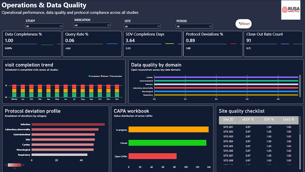
The next stage of the solution focuses on Operations and Data Quality, providing another layer of clinical trial monitoring.
Conclusion
Patient safety analytics requires more than simply counting adverse events.
Understanding the distribution, severity, seriousness, reporting patterns, and other safety-related indicators provides a more complete analytical perspective.
The RUSA Analytics Patient Safety Power BI Dashboard brings these metrics together through KPI cards, severity visualizations, trend analysis, safety signal analysis, and review-oriented views.
Using Power BI DAX, the dashboard can calculate dynamic metrics that respond to the selected filter context.
The result is an interactive Power BI clinical trial safety analytics solution that helps users explore safety-related patterns within the available dataset.
For RUSA Analytics, this dashboard demonstrates how Power BI, data modeling, DAX, and interactive visualization can be combined to transform complex clinical trial safety data into a structured intelligence experience.


Comments