
Clinical Trial Operations and Data Quality Dashboard Using Power BI | RUSA Analytics

Introduction
Clinical trial success depends not only on patient enrollment and safety monitoring but also on strong operational execution and reliable data quality.
As clinical trials progress, research teams need visibility into areas such as visit completion, data completeness, queries, source data verification, protocol deviations, documentation, and site close-out activities.
When these operational metrics are distributed across different datasets, it can become difficult to understand the overall quality and operational status of a clinical trial.
A centralized Power BI dashboard can bring these metrics together and provide an interactive view of clinical trial operations and data quality.
The fourth dashboard in the RUSA Analytics Clinical Trial Intelligence solution focuses on Operations and Data Quality.
This Power BI dashboard brings together operational KPIs, data quality indicators, visit completion trends, protocol deviations, CAPA information, and site-level quality metrics.
The objective is to provide a structured analytical view that helps users understand where operational activities are progressing well, where data quality may require attention, and which sites or domains may need further investigation.
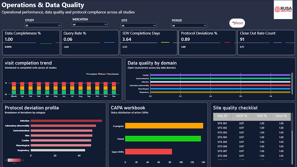
RUSA Analytics Power BI Operations and Data Quality Dashboard for monitoring clinical trial operational performance and data quality.
What Is Clinical Trial Operations and Data Quality Analytics?
Clinical trial operations and data quality analytics focuses on monitoring the processes that support the execution and management of a clinical study.
While enrollment analytics focuses on recruitment and patient safety analytics focuses on adverse events, operations and data quality analytics provides visibility into the operational side of the trial.
A Power BI dashboard can bring together metrics such as:
Data Completeness
Query Rate
SDV Completion Days
Protocol Deviations
Close-Out Rate
Visit Completion
Data Quality by Domain
Site Quality Metrics
CAPA Information
Documentation Performance
By combining these metrics, Power BI can provide a more connected view of operational performance.
Why Clinical Trial Data Quality Matters
Clinical trial analytics depends on the quality of the underlying data.
If data is incomplete, delayed, inconsistent, or affected by unresolved queries, analytical reporting can become more difficult.
Data quality monitoring therefore plays an important role in understanding the operational condition of a clinical trial.
A Power BI data quality dashboard can help users investigate questions such as:
How complete is the available data?
How many queries are being generated?
How quickly are SDV activities being completed?
How many protocol deviations are recorded?
How are visits progressing?
Which data domains require attention?
Which sites have lower quality metrics?
What CAPA activities require monitoring?
RUSA Analytics Operations and Data Quality Power BI Dashboard
The fourth page of the RUSA Analytics Clinical Trial Intelligence Dashboard brings operational and data quality indicators into one Power BI report page.
The dashboard includes several important KPIs:
Data Completeness
Query Rate
SDV Completion Days
Protocol Deviations %
Close-Out Rate Count
These KPIs provide a quick overview of the operational and data quality status represented in the dataset.
Data Completeness
The Data Completeness KPI provides an overview of how complete the available clinical trial data is within the current analysis.
Data completeness is important because incomplete records can affect downstream reporting and analysis.
Using Power BI, users can monitor this KPI together with other quality indicators to gain a broader understanding of data conditions.
The metric can also be analyzed under different filter contexts, allowing users to explore the data by study, site, date, or other available dimensions.
Query Rate
The Query Rate KPI provides an indication of the level of queries represented in the clinical trial data.
Queries can be an important part of data quality and operational monitoring.
By monitoring query-related metrics alongside completeness and other indicators, users can obtain a broader view of the quality-related activity within the dataset.
Power BI makes it possible to visualize this information interactively rather than relying only on static reports.
SDV Completion Days
The SDV Completion Days KPI provides visibility into the time associated with source data verification activities.
This metric can be analyzed as part of the broader operational performance view.
Combining SDV-related metrics with visit completion, site performance, and other operational indicators can provide additional context for understanding site-level activity.
The RUSA Analytics Power BI dashboard brings these metrics together so users can analyze them from a common reporting environment.
Protocol Deviations %
Protocol deviations represent another important operational area.
The Protocol Deviations % KPI provides a summarized view of protocol deviation activity based on the defined calculation within the Power BI data model.
Rather than reviewing protocol deviation records individually, the dashboard allows users to analyze the overall metric alongside other operational indicators.
This provides a starting point for identifying areas that may require further investigation.
Close-Out Rate Count
The Close-Out Rate Count KPI provides visibility into close-out activity represented within the dataset.
Close-out activities are an important part of clinical trial operations.
By including this metric alongside visit completion, data quality, and site-level performance indicators, the dashboard provides a more comprehensive operational view.
Visit Completion Trend
The Visit Completion Trend is one of the key visualizations on the Operations and Data Quality page.
Clinical trials involve scheduled patient visits and associated data collection activities.
Monitoring visit completion over time can help users understand operational progress.
A Power BI trend visualization can make changes easier to identify than reviewing individual records.

Visit completion trend visual created in Power BI to monitor clinical trial operational activity over time.
Why Visit Completion Analysis Is Useful
Visit completion provides an operational perspective on clinical trial progress.
A trend visualization can help users investigate:
Whether visit activity is progressing over time
Whether there are periods of lower activity
How visit completion changes across the study timeline
Whether additional investigation may be required
When combined with site-level filters, Power BI can allow users to move from an overall trend to more detailed analysis.
Data Quality by Domain
The Data Quality by Domain visualization provides a more detailed view of quality metrics across different data areas.
Clinical trial data can contain multiple domains, and each domain may have different quality characteristics.
A Power BI visualization makes it easier to compare these areas within the same report.
This can help users identify domains where quality metrics are stronger or where additional attention may be required.

Data quality by domain analysis created with Power BI for clinical trial data monitoring.
Protocol Deviation Profile
The Protocol Deviation Profile provides another layer of operational analysis.
Instead of looking only at the overall Protocol Deviations percentage, users can explore how deviations are distributed within the available categories.
This provides more context for understanding the underlying deviation profile.
Power BI can present this information through interactive charts that respond to available filters and selections.

Protocol deviation profile visual created in Power BI to analyze clinical trial operational deviations.
CAPA Workbook
The dashboard also includes a CAPA Workbook section.
CAPA refers to Corrective and Preventive Action activities.
In an operational analytics environment, CAPA information can provide visibility into actions associated with identified issues.
A Power BI-based CAPA view can help organize information so users can monitor relevant activities alongside broader data quality and operational metrics.
This provides an additional connection between:
Issue Identification
↓
Corrective Action
↓
Preventive Action
↓
Monitoring
The dashboard therefore goes beyond simply identifying data quality issues and provides an analytical structure for monitoring associated operational actions.
Site-Level Data Quality Metrics
One of the most important elements of the Operations and Data Quality dashboard is the site-level quality table.
The table includes metrics such as:
Site_ID
EEDF %
SDV %
DOC %
These metrics provide a more detailed view of site-level data quality and operational performance.
Dynamic Site Quality Analysis with Power BI
An important principle of this dashboard is that site-level values should be calculated dynamically rather than manually entered.
Power BI measures can calculate the relevant metrics based on the selected Site_ID and the underlying data.
This means that the same Power BI table can display quality metrics for multiple sites.
Instead of creating separate calculations for each individual site, the measures respond to the current filter context.
This approach makes the RUSA Analytics dashboard more scalable and easier to maintain.
EEDF, SDV, LAB, and DOC Metrics
The site quality table provides multiple dimensions of operational performance.
EEDF %
EEDF % provides a site-level quality indicator based on the calculation defined within the analytical model.
SDV %
SDV % provides visibility into source data verification performance.
LAB %
LAB % provides a laboratory-related quality indicator based on the available dataset.
DOC %
DOC % provides visibility into documentation-related performance.
Together, these metrics provide a multidimensional view of site quality.
Rather than evaluating a site using a single score, Power BI allows users to compare multiple indicators simultaneously.
Using DAX for Dynamic Site Quality Metrics
DAX is particularly important for creating the site-level metrics used in this Power BI dashboard.
Measures can be created for:
EEDF %
SDV %
LAB %
DOC %
Data Completeness
Query Rate
Visit Completion
Protocol Deviation %
Other operational indicators
The measures can respond to the selected Site_ID and other filters.
For example:
Study → Country → Site → Date
When the filter context changes, Power BI recalculates the relevant metrics.
This makes the dashboard dynamic rather than dependent on fixed site values.
Why Dynamic Power BI Measures Matter
Manually entering site-level values can create several problems.
It can make dashboards harder to maintain and can result in outdated information when the underlying data changes.
Using DAX measures provides a better approach.
When new site records become available, the Power BI model can calculate the relevant metrics based on the underlying data.
This makes the reporting solution more scalable.
For a clinical trial analytics solution involving many sites, this approach can significantly simplify dashboard maintenance.
From Data Quality Monitoring to Operational Intelligence
The dashboard connects multiple operational areas into one analytical workflow.
The process can be understood as:
Raw Clinical Trial Data
↓
Data Quality Processing
↓
Power BI Data Model
↓
DAX Calculations
↓
Quality KPIs
↓
Site-Level Analysis
↓
Operational Monitoring
↓
Areas Requiring Attention
This approach allows users to move from individual operational records toward a more structured view of clinical trial data quality.
Why Power BI Is Useful for Clinical Trial Data Quality
Power BI provides several capabilities that make it useful for operational and data quality analytics.
Interactive Data Quality Monitoring
Users can explore quality metrics through interactive visualizations.
Dynamic DAX Calculations
DAX measures allow metrics to respond to the selected filter context.
Site-Level Analysis
Users can analyze EEDF %, SDV %, LAB %, and DOC % for multiple sites.
Trend Analysis
Visit completion and other operational metrics can be analyzed over time.
Multi-Dimensional Reporting
Different operational domains can be analyzed together.
Centralized Monitoring
Multiple operational indicators can be presented in one Power BI report page.
The Role of RUSA Analytics in Clinical Trial Data Quality
RUSA Analytics focuses on transforming complex data into analytics and intelligence solutions.
In this clinical trial project, Power BI provides the reporting and visualization layer for operational and data quality analysis.
The overall approach can be represented as:
The combination of RUSA Analytics and Power BI provides a structured approach to transforming operational data into an interactive analytical experience.
Benefits of the Operations and Data Quality Power BI Dashboard
A well-designed RUSA Analytics Power BI Operations and Data Quality Dashboard can provide several benefits.
Centralized Data Quality Monitoring
Important quality indicators can be viewed in one place.
Site-Level Visibility
Users can compare quality metrics across multiple sites.
Dynamic Calculations
Power BI DAX measures can automatically recalculate metrics based on filter context.
Operational Trend Analysis
Users can monitor visit completion and other time-based metrics.
Protocol Deviation Monitoring
Deviation metrics can be analyzed alongside other operational indicators.
CAPA Visibility
Corrective and preventive action information can be incorporated into the operational monitoring framework.
Multi-Dimensional Site Quality
EEDF %, SDV %, LAB %, and DOC % provide multiple perspectives on site performance.
Connecting All Four Clinical Trial Power BI Dashboards
This Operations and Data Quality dashboard completes the four-part RUSA Analytics Clinical Trial Intelligence Dashboard.
The complete analytics framework can be represented as:
1. Executive Overview
Portfolio-level clinical trial KPIs
2. Enrollment & Site Performance
Patient recruitment and site performance
3. Patient Safety
Adverse event and safety analytics
4. Operations & Data Quality
Operational performance and data quality
Complete Clinical Trial Intelligence
Each Power BI page provides a different analytical perspective while contributing to the overall clinical trial intelligence solution.
Clinical Trial Data
↓
Power BI Data Model
↓
Executive OverviewStudies • Enrollment • Active Sites • Study Duration
↓
Enrollment & Site PerformanceRecruitment • Site Performance • Site Ranking
↓
Patient SafetyAdverse Events • Severity • Safety Trends
↓
Operations & Data QualityCompleteness • Queries • SDV • Deviations • CAPA
↓
Interactive Clinical Trial Intelligence
Conclusion
Clinical trial analytics does not end with monitoring enrollment and patient safety.
Operational execution and data quality are equally important components of a complete clinical trial intelligence solution.
The RUSA Analytics Operations and Data Quality Power BI Dashboard brings together important indicators such as:
Data Completeness
Query Rate
SDV Completion Days
Protocol Deviations %
Close-Out Rate
Visit Completion
Data Quality by Domain
Protocol Deviation Profile
CAPA
EEDF %
SDV %
LAB %
DOC %
Using Power BI DAX measures, these metrics can be calculated dynamically and analyzed across multiple sites and other available dimensions.
The result is an interactive Power BI clinical trial operations and data quality solution that provides a more detailed view of how clinical trial activities are progressing.
For RUSA Analytics, this dashboard demonstrates how data modeling, DAX, Power BI visualization, and site-level analytics can work together to transform complex clinical trial data into a structured intelligence solution.
By combining RUSA Analytics and Power BI, organizations can build a connected analytical framework covering clinical trial portfolio performance, enrollment, site performance, patient safety, operations, and data quality.


Comments