
Clinical Trial Intelligence Dashboard: How Power BI Helps Monitor Clinical Trial Performance

Introduction
Clinical trials generate large amounts of data across studies, sites, patients, visits, enrollment, and operational activities. When this information is stored across different tables and systems, it can become difficult for clinical research teams and stakeholders to understand overall trial performance.
A well-designed Power BI dashboard can bring this information together into a single interactive view.
RUSA Analytics uses data analytics and business intelligence approaches to transform complex datasets into meaningful insights. In this clinical trial analytics example, Power BI is used to create an interactive Clinical Trial Intelligence Dashboard that provides an executive-level view of study performance, patient enrollment, site activity, and operational indicators.
The goal is simple: turn complex clinical trial data into information that is easier to understand, monitor, and act upon.

Clinical Trial Intelligence Dashboard built with Power BI to provide an executive overview of clinical trial performance.
What Is a Clinical Trial Intelligence Dashboard?
A Clinical Trial Intelligence Dashboard is an analytics solution designed to provide a consolidated view of important clinical trial metrics.
Instead of reviewing individual datasets separately, stakeholders can use a Power BI report to analyze information from multiple areas such as:
• Clinical studies
• Clinical trial sites
• Patient enrollment
• Patient visits• Study duration
• Geographic performance
• Study status
• Site activity
• Enrollment trends
The dashboard can help transform raw clinical trial data into visual insights that support monitoring and operational analysis.
In this project, the dashboard is built using a synthetic clinical trial dataset and Power BI.
Why Clinical Trial Analytics Matters
Clinical trial performance depends on several interconnected factors.
A study may have multiple sites across different countries. Each site may have different enrollment performance. Patients may progress through different visits, while operational teams need to monitor study timelines and performance indicators.
Looking at each dataset separately can make it difficult to identify the overall picture.
Power BI provides a way to combine these datasets into an interactive analytical environment.
With an appropriately designed data model and DAX measures, users can move from high-level KPIs to detailed performance information.
For example, an executive may want to know:
How many studies are currently being monitored?
How many patients have been enrolled?
How many sites are active?
What is the overall enrollment rate?
Which countries are contributing to enrollment?
How long are the studies running?
These questions can be answered through a centralized Power BI dashboard.
Clinical Trial Dashboard Architecture
The dashboard follows a structured analytics workflow.
The overall process can be represented as:
SOURCE DATA ↓
DATA CLEANING AND TRANSFORMATION ↓
POWER BI DATA MODEL ↓ DAX MEASURES ↓ INTERACTIVE VISUALIZATIONS ↓
CLINICAL TRIAL PERFORMANCE INSIGHTS ↓ OPERATIONAL MONITORING
How the Data Flows
Clinical trial information is organized into different tables representing important business entities.
The model used for this dashboard includes tables such as:
StudiesSitesPatientsVisitsAdverse EventsProtocol DeviationsDate
These tables can be connected through appropriate relationships so that Power BI can analyze the information across different dimensions.
For example, a study can have multiple sites, while a site can be associated with patient enrollment and visit activity.
A dedicated Date table also enables time-based analysis such as enrollment trends and study timelines.
Studies + Sites + Patients + Visits + Adverse Events + Deviations ↓
Power Query ↓ Power BI Data Model ↓ DAX Measures ↓ Executive Overview ↓ Enrollment & Site Performance ↓ Patient Safety ↓ Operations & Data Quality
Clinical trial data architecture used to transform raw data into an interactive Power BI analytics solution.
Executive Overview Dashboard
The first page of the solution is the Executive Overview.
The purpose of this page is to provide a high-level summary of the clinical trial portfolio.
Instead of requiring users to examine multiple datasets, the Executive Overview presents important indicators through KPI cards and visualizations.
The dashboard includes KPIs such as:
Total Studies
Overall Enrollment Rate
Total Enrolled Patients
Active Sites
Median Study Duration
Total Studies
The Total Studies KPI provides an overview of the number of studies included in the analysis.
This metric gives stakeholders an immediate understanding of the size of the clinical trial portfolio being monitored.
When combined with study status and enrollment information, it can provide additional context about the current trial portfolio.
Overall Enrollment Rate
Enrollment is one of the important indicators used to understand clinical trial recruitment performance.
The Overall Enrollment Rate provides a consolidated view of enrollment progress across the available studies.
A Power BI measure can calculate this metric dynamically rather than relying on manually entered values.
This means the result can change automatically when users apply filters such as study, country, site, or other dimensions.
Total Enrolled Patients
The Total Enrolled Patients KPI provides a high-level view of patient recruitment.
Patient enrollment is particularly useful when analyzed together with:
Study
Site
Country
Time period
Enrollment rate
This allows stakeholders to move from the overall patient count toward more detailed recruitment analysis.
Active Sites
Clinical trials may involve multiple research sites.
The Active Sites KPI provides a quick indication of how many sites are participating in the current analysis.
Site-level analysis becomes especially important when enrollment performance differs between sites.
The Executive Overview therefore acts as the starting point before moving into detailed site performance analysis.
Median Study Duration
Study duration provides another important portfolio-level perspective.
Using the median instead of simply looking at individual study durations can provide a useful summary when study timelines vary.
This metric can help stakeholders understand the typical duration represented within the selected clinical trial portfolio.
Enrollment Trajectory
The Executive Overview also includes an enrollment trajectory visualization.
A time-based visualization allows users to understand how enrollment changes over the study period.
Instead of looking only at a single enrollment number, stakeholders can observe the direction and pace of enrollment.
This can help answer questions such as:
Is enrollment increasing over time?
Are there periods of slower enrollment?
Are different studies progressing at different rates?
Are recruitment patterns consistent across the portfolio?

Enrollment trajectory visual showing how clinical trial enrollment changes over time.
Study Portfolio Status
Another important component of the Executive Overview is the Study Portfolio Status visualization.
This provides a simple way to understand the distribution of studies across different statuses.
Portfolio status information can help stakeholders distinguish between studies that are progressing, completed, active, or require additional attention based on the underlying dataset.
Enrollment by Country
Clinical trials can involve sites distributed across different geographic locations.
The Enrollment by Country visual provides a geographic perspective of patient recruitment.
This visualization helps identify where enrollment activity is concentrated within the current dataset.
Combining country-level information with site-level metrics can provide a deeper understanding of regional recruitment performance.

Geographic view of clinical trial enrollment across countries.
Management Attention Areas
The Management Attention Areas section provides another important layer of the Executive Overview.
A dashboard should not only display numbers. It should help users identify areas that may require additional investigation.
For example, attention may be required when there are differences in:
Enrollment performance
Site activity
Study progress
Operational metrics
Data quality
This approach changes the dashboard from a simple reporting tool into an analytical monitoring solution.
Using DAX to Create Dynamic Clinical Trial Metrics
DAX is an important part of building a Power BI clinical trial dashboard.
Instead of hardcoding values into visuals, DAX measures can calculate metrics dynamically based on the current filter context.
For example, metrics can be created for:
Total Studies
Total Patients
Active Sites
Enrollment Rate
Study Duration
Enrollment Trends
Site Performance
Data Quality
The advantage of using measures is that the dashboard can respond when users select different studies, sites, countries, or time periods.
For example, selecting a particular study can automatically update the relevant KPI cards and charts across the report.
Interactive Filtering in Power BI
One of the major advantages of Power BI is interactivity.
Users can apply filters and slicers to explore the data from different perspectives.
For example, a user may filter the report by:
Study
Site
Country
Date
Study Status
Other available clinical trial dimensions
The visualizations can then update according to the selected filter context.
This allows the same report to support different analytical questions without creating separate static reports for every scenario.
From Executive Overview to Detailed Analysis
The Executive Overview is only the first layer of the clinical trial analytics solution.
A complete clinical trial intelligence solution can be divided into several analytical areas.
The next level can focus on Enrollment and Site Performance.
This area can help answer questions about patient recruitment, site-level performance, enrollment pace, and high-risk sites.
Another area can focus on Patient Safety, where adverse event information can be analyzed using severity, seriousness, trends, and study-level views.
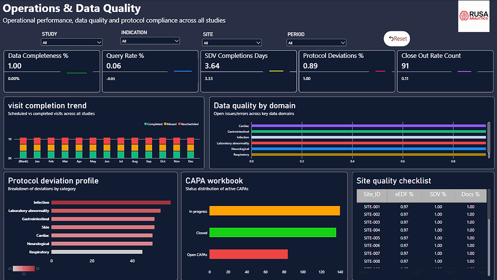
The final area can focus on Operations and Data Quality, including visit completion, data completeness, query rates, SDV performance, protocol deviations, and documentation metrics.
This creates a connected analytics framework rather than a collection of unrelated charts.
Why Power BI Is Useful for Clinical Trial Analytics
Power BI provides several capabilities that are useful for analytical reporting.
It can connect data sources, transform data, create relationships between tables, define DAX measures, and present information through interactive visualizations.
A properly designed semantic model is especially important because the quality of the analytical results depends on how the underlying data is structured.
The dashboard therefore combines:
Data modeling
Data transformation
Relationships
Date analysis
DAX calculations
Interactive visuals
KPI design
Filtering
These components work together to create a complete analytics solution.
The Role of RUSA Analytics
RUSA Analytics focuses on turning complex business and operational data into actionable intelligence.
For healthcare and life sciences analytics, a structured approach can help organizations bring together information from different operational areas and make it easier to monitor performance.
In this clinical trial dashboard example, Power BI provides the visualization and analytics layer, while the underlying data model and calculations provide the foundation for meaningful analysis.
The result is a centralized clinical trial intelligence experience that allows users to move from portfolio-level KPIs to detailed operational analysis.
Key Benefits of the Clinical Trial Intelligence Dashboard
A well-designed clinical trial Power BI dashboard can provide several benefits:
Centralized clinical trial information
Faster access to important KPIs
Interactive study and site analysis
Improved visibility into enrollment performance
Geographic enrollment analysis
Time-based trend analysis
Site-level monitoring
Operational performance visibility
Data quality monitoring
Better communication of analytical insights
Conclusion
Clinical trial data can become complex when information is distributed across studies, sites, patients, visits, and operational datasets.
A Power BI-based Clinical Trial Intelligence Dashboard provides a practical way to bring these datasets together and convert them into interactive insights.
The Executive Overview acts as the starting point by presenting key indicators such as Total Studies, Overall Enrollment Rate, Total Enrolled Patients, Active Sites, and Median Study Duration.
From there, users can move into detailed areas such as enrollment and site performance, patient safety, and operations and data quality.
For RUSA Analytics, this type of analytics solution demonstrates how data modeling, DAX, and Power BI visualization can work together to create a more structured approach to clinical trial intelligence.
The most important principle is not simply creating attractive charts. The real value comes from building a reliable data model and presenting the right metrics in a way that helps stakeholders understand what is happening across the clinical trial portfolio.


Comments